Our work speaks for itself.Take a look at a selection of our recent projects, crafted with care and designed to make an impact. Each one tells a story of creativity, collaboration, and results.
RacerX — Brand Identity Development
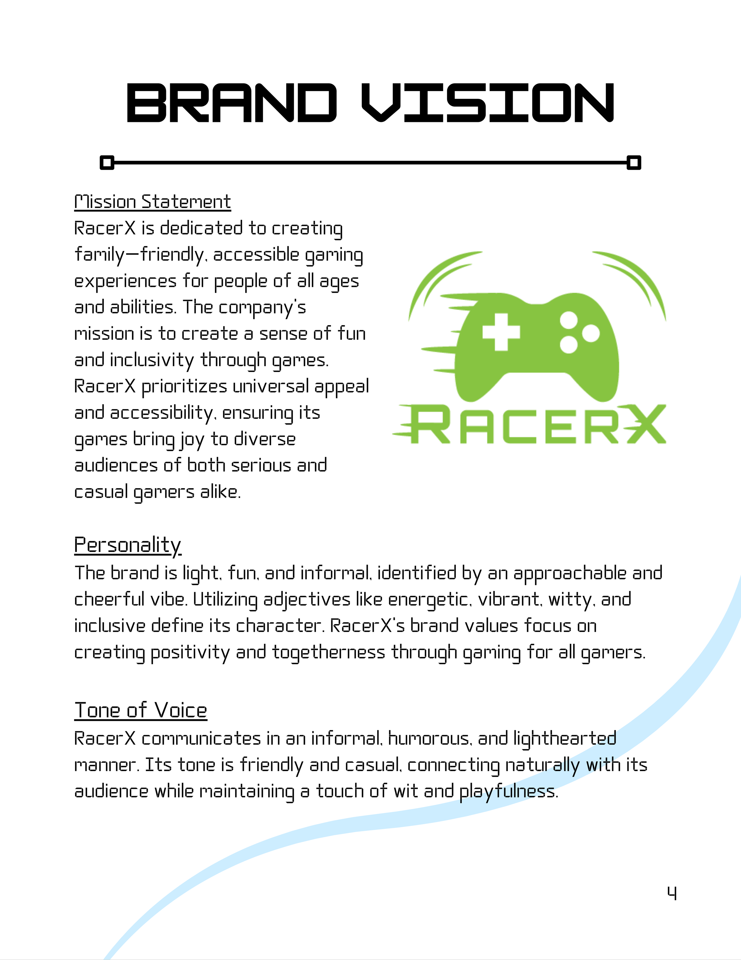
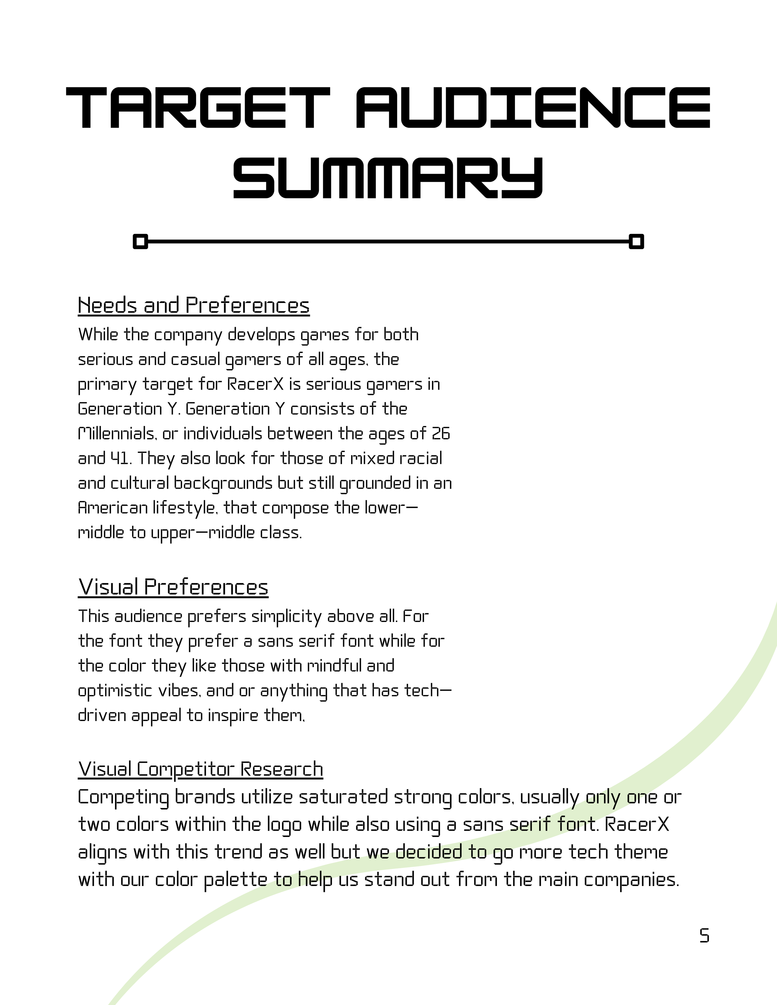
For this project, I developed a complete brand identity for RacerX, a family‑friendly gaming company focused on accessibility, inclusivity, and energetic gameplay. The goal was to create a visual system that felt modern, approachable, and tech‑driven while appealing to both casual and serious gamers.
Name Development
The name RacerX was chosen to capture a sense of speed, excitement, and forward momentum — qualities that reflect the brand’s energetic personality. The “X” adds a dynamic edge, suggesting exploration, challenge, and the thrill of leveling up. It also gives the brand a memorable, punchy identity that stands out in the gaming space.
Logo Design
The logo centers around a stylized game controller with motion lines, symbolizing movement, action, and the fast‑paced nature of gaming. The rounded shapes and friendly silhouette reinforce the brand’s accessible, family‑friendly mission, while the bold geometric typography adds a modern, tech‑inspired feel.
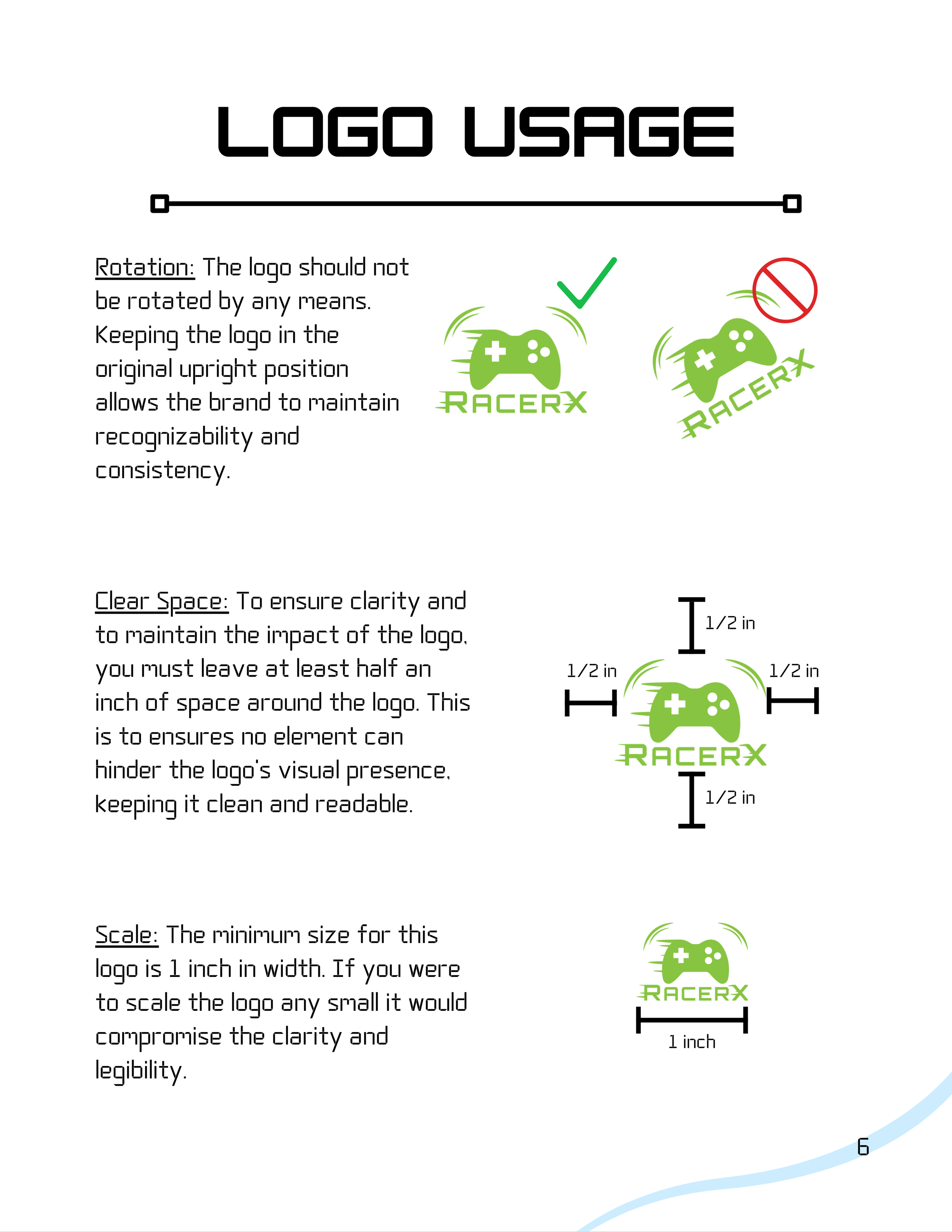
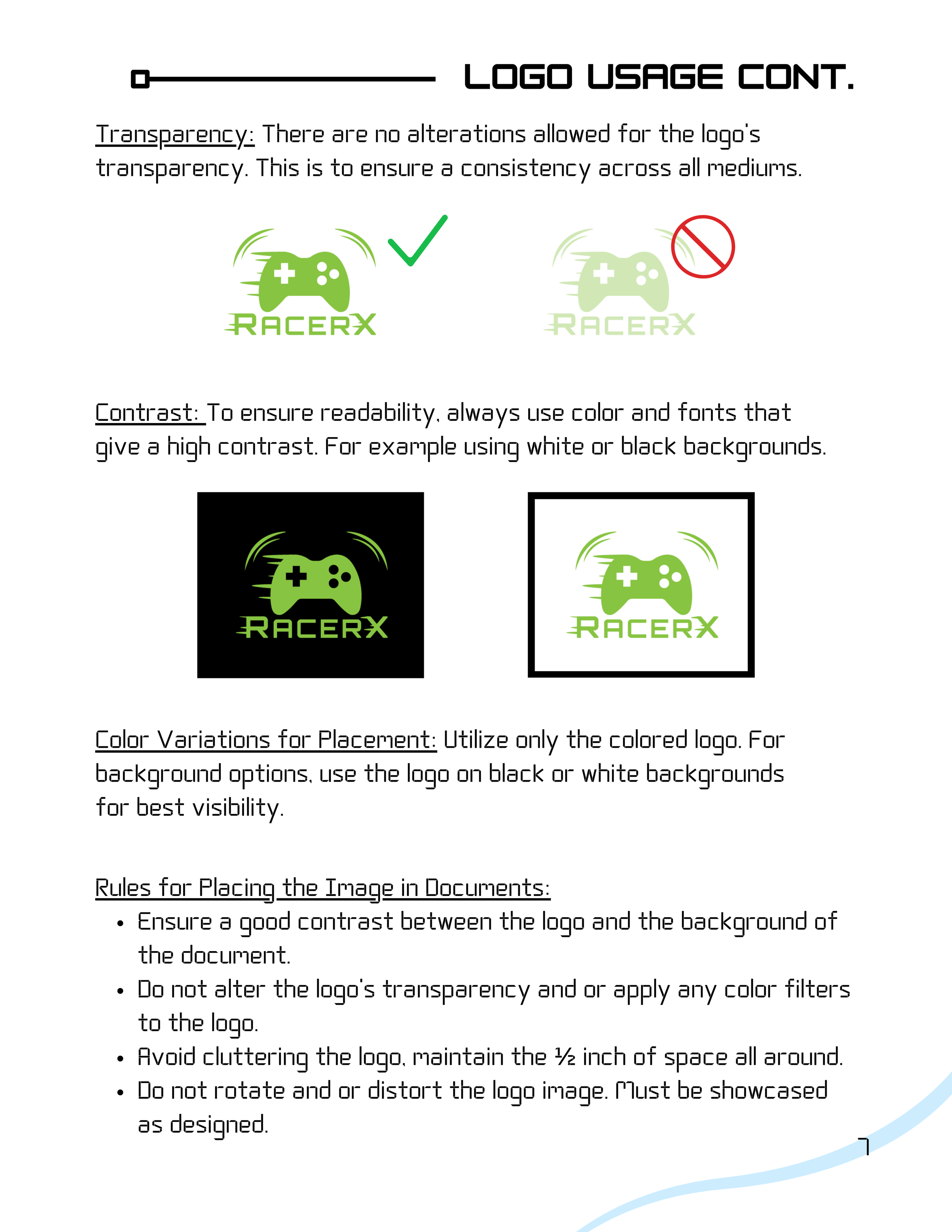
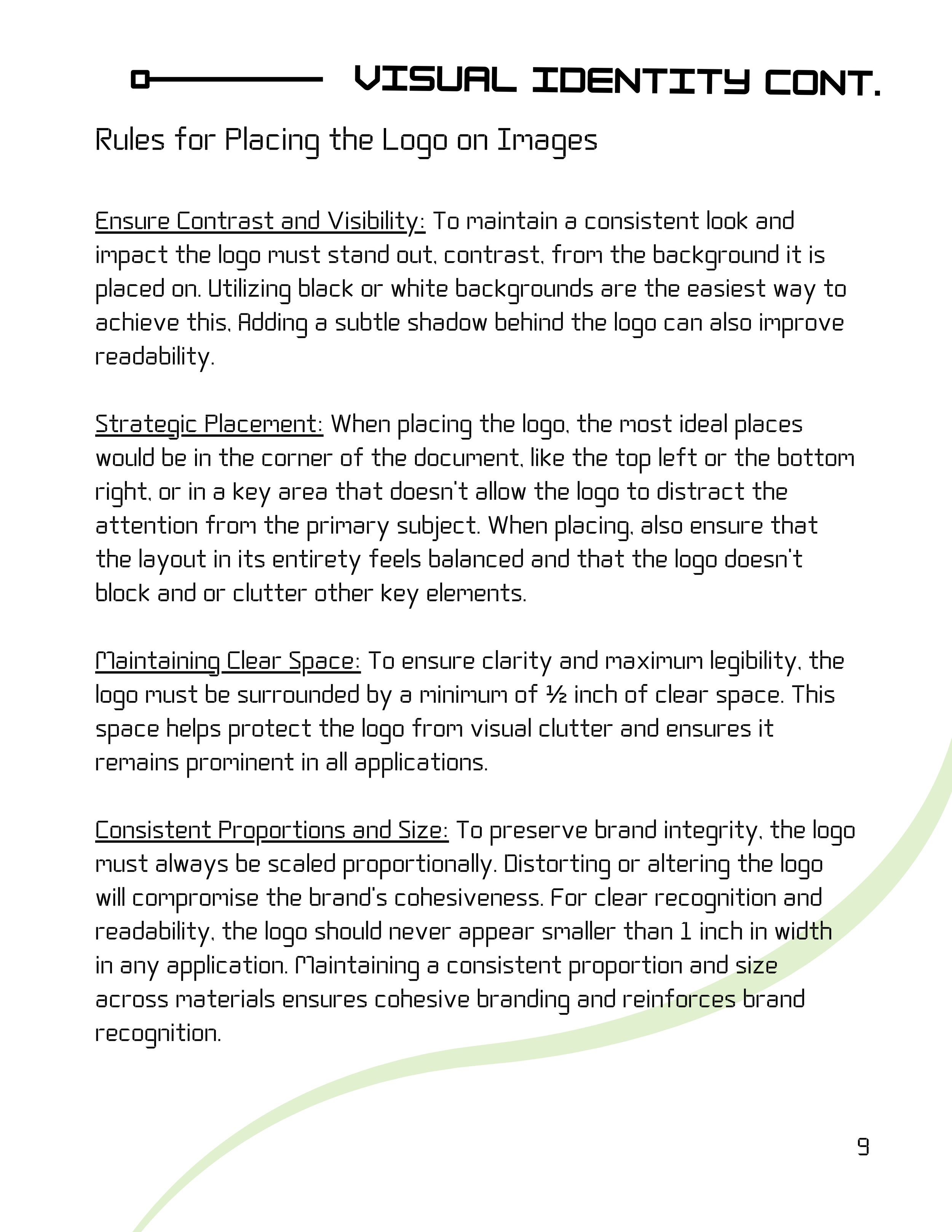
Clear spacing, scale rules, and placement guidelines were established to ensure the logo remains readable, consistent, and visually strong across all applications.
Color Palette
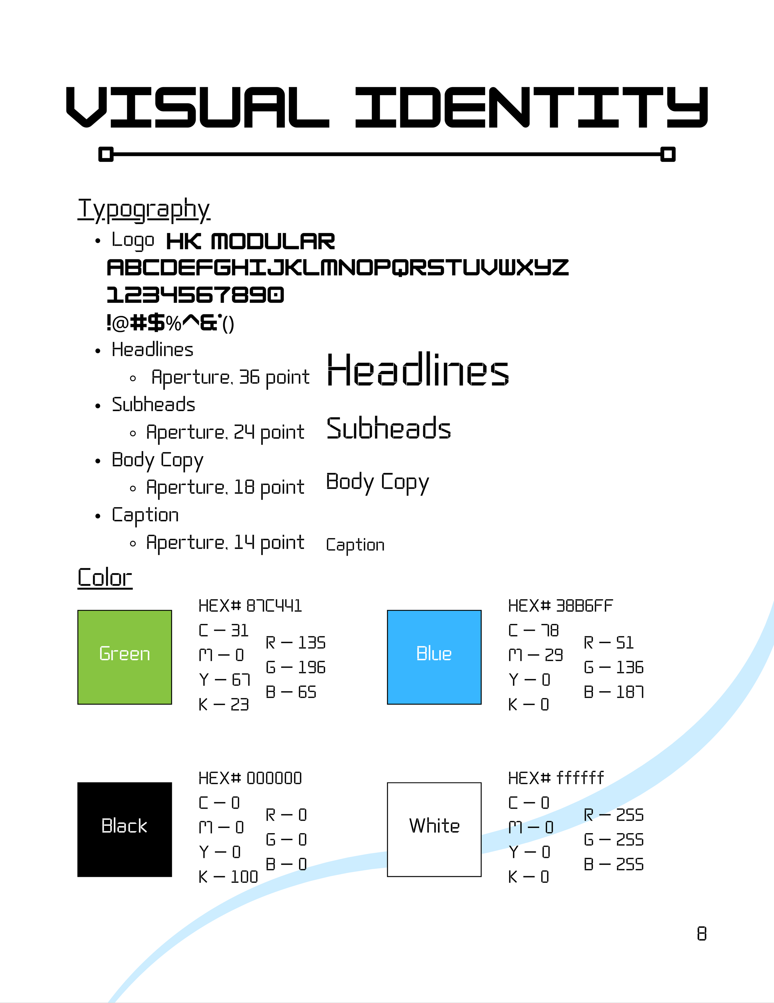
The RacerX palette combines vibrant green and tech‑blue, supported by black and white for contrast and clarity.
• The green conveys energy, optimism, and approachability — aligning with the brand’s cheerful personality.
• The blue adds a futuristic, digital tone that connects to the gaming world and helps the brand stand out from competitors who often rely on saturated reds or neon accents.
Together, these colors create a balanced identity that feels lively, modern, and universally appealing.
Visual Identity System
To maintain consistency, I developed a full typography system using HK Modular for the logo and Aperture for headlines, subheads, and body copy. These fonts reinforce the brand’s tech‑forward aesthetic while keeping readability high for diverse audiences.
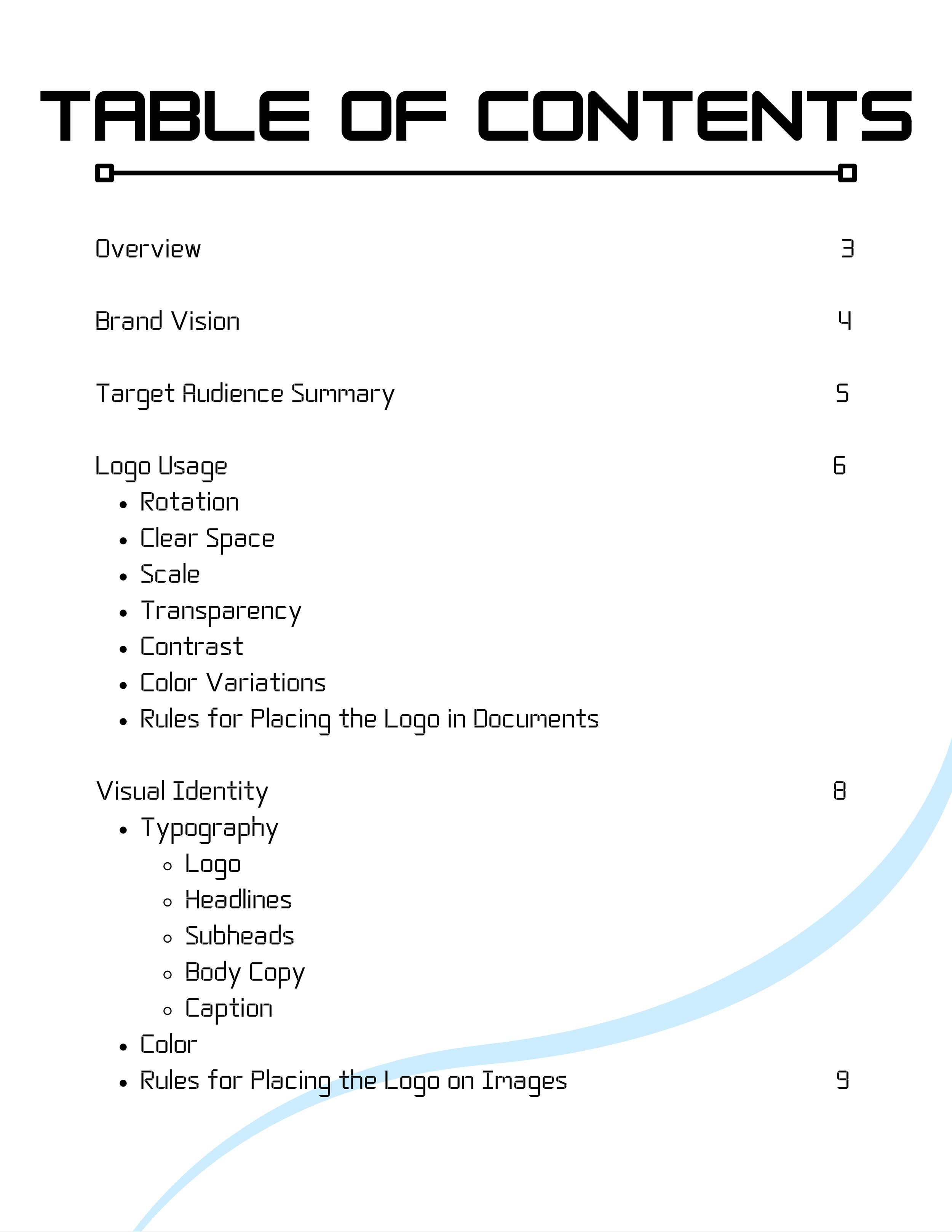
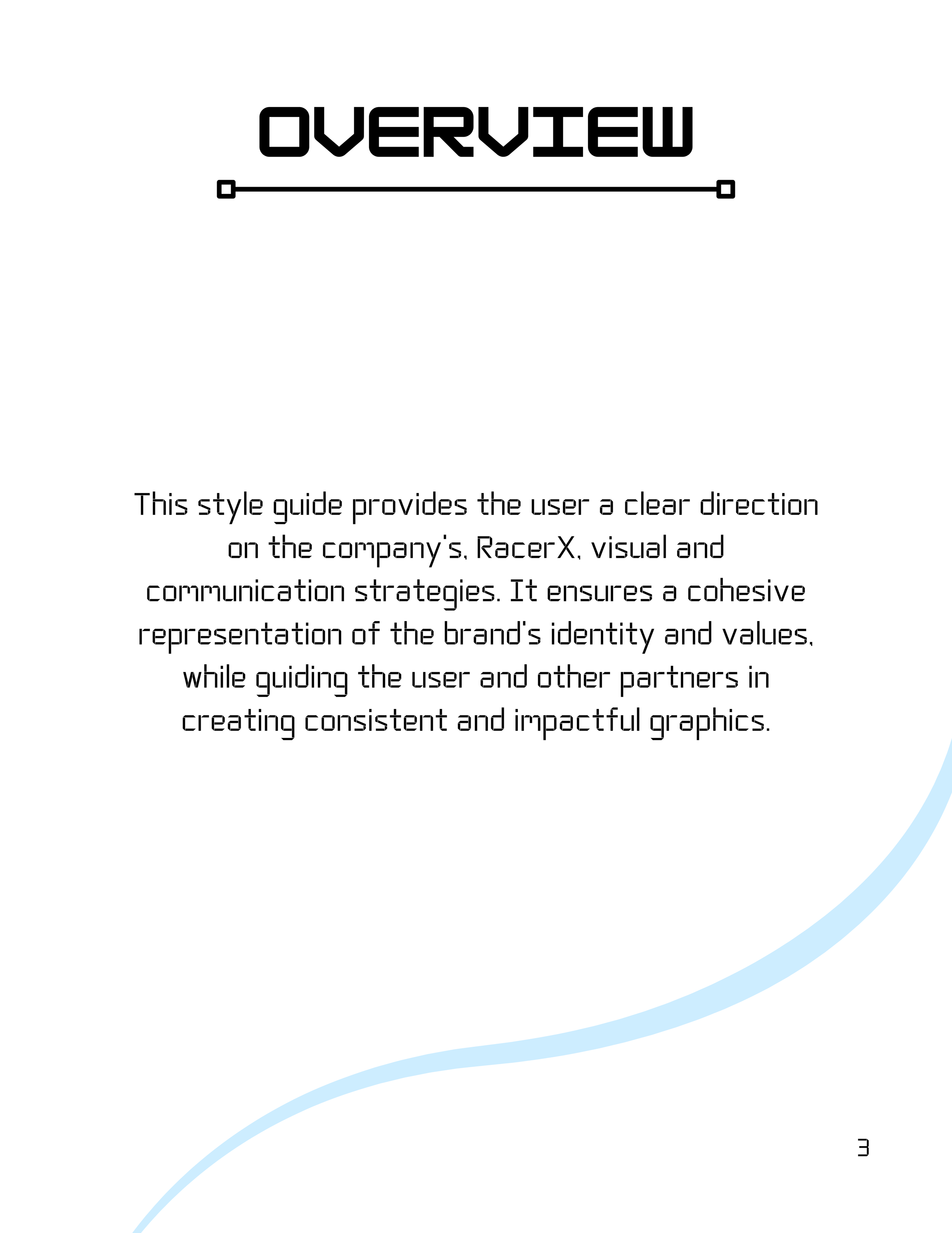
The visual identity guidelines outline logo usage, clear space, contrast rules, and placement standards to ensure cohesive branding across digital and print materials.